
|
| Notices |
It's been a while, Unregistered -- Welcome back to Eratosphere! |

|
|

07-22-2022, 06:11 PM
|
 |
Moderator
|
|
Join Date: Oct 2018
Location: UK
Posts: 1,687
|
|
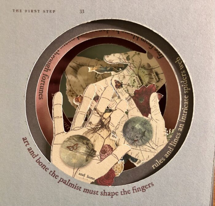
 Found sapphics: The Modern Palmist
Hi,
This is a hybrid work-in-progress. Context is that I made four erasure poems using 'The Modern Palmist' (a vintage book) as a source way back in April. The erasure poem aimed to follow a sapphic verse stress pattern,
I also aimed to subvert the meanings in the original text.
One of the original images (hand of an ecologist) is pending pub in 'Petrichor'
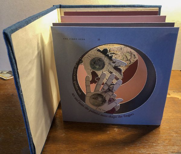
I'm now working at turning the four images in to a tunnel book, to see if they work. The image is a rough snapshot of the loose images - I still need to bind them.
The print quality is horrible in these, as they're just printed on my basic (old) inkjet. But, beyond aghast sighs at print quality - how do these work for you?
Full erasure text reads; art and bone the palmist must shape the fingers/ rules and lines an intricate spiders web/free from blame he dances and sways through fortunes/ delicate worries.
WIP below (this is a snap of the hard copy so far):
I'd be hugely grateful to find out how this works for people - I may not be able to edit this piece too much but I can use comments to see if the method works and/or how to make it more effective if I try again
Sarah-Jane
Last edited by Sarah-Jane Crowson; 07-22-2022 at 06:13 PM.
Reason: clarity
|
07-22-2022, 07:43 PM
|
 |
Member
|
|
Join Date: Nov 2006
Location: Brooklyn, NY USA
Posts: 6,119
|
|
Hi, S-J, I think this is an example of what you call Vispo. I dont mean to make you feel bad at all, but as you may have guessed, I cant relate to it in any satisfactory way. In some way I think that is related to my strong feeling that Vispo, as far as I can see, is a genre that could be most easily faked by an electronic Artificial Intelligence. Why? It has the same lack of explicit logical or direct emotional links between its parts as a collage, only more so. It asks the viewer (consumer) to supply the links, rather than the links being supplied by the human creator. You are human, so its ok to do these things in my opinion. However, in the future, a device could select whatever its filters allow, and the viewer is then made to make meaning, a process that I think could lead to, at best, mechanical advertising, and at worst
I dont want to go there. Sorry, Im sure you mean well. Its not for me in any case.
|
07-23-2022, 05:16 AM
|
|
Moderator
|
|
Join Date: Oct 2018
Location: UK
Posts: 1,687
|
|
Allen, you don't make me feel bad at all. I really appreciate your comments.
This is a worthwhile critical challenge, from my perspective, much of it valid and needing me to think about sound counter-arguments - and it's also an interesting way to think about poetry/arts in general. It's the sort of comment that helps me think about my work and improve it.
So, I think in terms of collage and erased/found text you have a point. It'd be possible (and has probably been done already) to devise an programme that crawled through text on a single page and found stress patterns - language/text is a coded entity anyway. So rhythmic patterns could be found. Equally, a computer could be programmed to make sure that these made syntactical (?) sense and some kind of logical sense.
And with the visual images you could set up a set of four/five key compositions and choices of image (flower/butterfly etc) & press enter. It's a process I replicate when making these. I work in series, using the same motifs. Sometimes I use motifs that represent me, and my life experience or sometimes my motifs are my friends etc - which is probably more human and would be harder to replicate as the choices there are emotional/subjective - but not in this one - they are simply images that have some bearing/link to the source material which a computer could probably replicate.
But, the creative decision-making in the setting up of the choice of source and the particular choice of initial visual objects to use in compositions I think is more 'human', unless it was very derivative (for example, based on a particular artist's compositions).
I also think that the nuance, the interplay between source text and erased text is something a computer would struggle to replicate, as it's based on essentially subjective/cultural decision-making - it's more holistic and I struggle to reduce it to an algorithm. And there's also the creative decisions in deciding to create the piece - why, why does this matter, that are more 'human'.
And there's the choice of decisions about form. What source, what method (erasure), why, and then how to best put the materials together (tunnel book, accordion book) - here is where it gets even more human - as it's about sensory decisions like the feel of paper, the choice of ink, the smell of the artefact. I'm going to bind this sample, so it's also about the binding, how that works with materials and source - and the weight of this.
These are more human decisions. That particular synergy of material, source text, composition, text, all swirling around and (hopefully) not ending up with pea soup - although I do not think that this piece is great, by a long way - there are aspects that are not very good). What I'm taking out of this (and this is why I appreciate constructive critical comments so much) is that I probably must try to make the subtle interplay between source and 'erased' material more obvious, more articulated, and that creating artefacts/objects is more important than I thought.
Too long! But thank you. I share your concerns about AI. I worry about the messy human getting lost. I think it's important to discuss.
Sarah-Jane

|
07-23-2022, 06:04 AM
|
|
Member
|
|
Join Date: May 2013
Location: England, UK
Posts: 5,005
|
|
Sarah,
I'm not entirely clear what I'm looking at here, so I'm not entirely sure what I'm being asked to comment on. Is this image all the reader/viewer sees (a series of pages, one behind the other)?. Or is it a book that opens out (or moves in some way) so that you could maybe provide photos of each page / other views? Also are you just asking if we think the concept works and about the overall effect, or do you want critique on individual images / lines?
Sarah and Allen
If a poem or work or art engages me, I really don't mind who or what created it.
Matt
Last edited by Matt Q; 07-23-2022 at 06:32 AM.
|
07-23-2022, 10:19 AM
|
|
Moderator
|
|
Join Date: Oct 2018
Location: UK
Posts: 1,687
|
|
Thanks Matt and fair point.
I am making up the sample today so I can show you. Appreciate it's a bit of an ask for people to leap into my headspace on the back of a rather confusing image.
Sarah
|
07-23-2022, 11:32 AM
|
|
Member
|
|
Join Date: Apr 2022
Location: St. Petersburg, Russia
Posts: 1,588
|
|
Hi, Sarah-Jane,
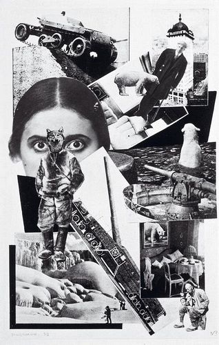
I’m with Matt: if art like this can be done by AI, you’ll just have more competition. I have a sneaking suspicion we’re all just messy wetware anyway. I’m even less competent to talk about vispo (if that’s what it is) than I am about popo, but what I’ve seen of yours reminds me of Soviet photomontage of the 1920s. This is a 1923 illustration by Alexander Rodchenko for one of Mayakovsky’s poems. (They were more into diagonal than circular back then.)
Carl
Last edited by Carl Copeland; 07-23-2022 at 12:03 PM.
|
07-23-2022, 12:49 PM
|
|
Member
|
|
Join Date: Nov 2006
Location: Brooklyn, NY USA
Posts: 6,119
|
|
Quote:
Originally Posted by Matt Q

If a poem or work or art engages me, I really don't mind who or what created it.
Matt
|
I truly think you should. I don’t want to fall in love with a crankcase full of diodes.
\\
|
07-23-2022, 02:47 PM
|
|
Moderator
|
|
Join Date: Oct 2018
Location: UK
Posts: 1,687
|
|
Hi Carl, and thank you. I love that photomontage. The fox-headed hunter is brilliant, and I can read narrative in it (might not be the narrative the author intended, but I can read it just the same).
Vispo, or visual poetry is huge and a very broad term. I work at the artsy, illustrative end, & get challenged by both free verse poets and traditional more analogue visual poets quite frequently (I use digital more than purists like but then I hate chopping up texts if they're in good condition). But this is my corner, I've trodden the grass down in it, and it's an interesting corner to be in.
Matt -
Here are some further images I took today. I can't stress enough to anyone who looks at these that this is NOT a professional quality book, it's a sample/mock-up. Hence the smears of copydex. But it hopefully gives you an idea of the tunnel book I'm making, which is very simple:
https://lightroom.adobe.com/shares/f...3fb30d285b999c
And if you're interested in tunnel books, these images by Su Blackwell (who is a very well-known paper artist) from the V&A collection are beautiful, imo.
Tunnel books are often made as artist books, and are a particular way of representing the world/narratives/places. Mine is more about found text and changing/re-inventing texts.
I would welcome all comments. I'd love to know whether you think it's interesting or aesthetically pleasing. I'd love to know whether you think that the concept works with the design (or whether these should have remained only as flat images .
Particular questions are:
Do you think that the way I've formatted the text works (round the circle) or should I try to replicate the erased/cut out text?
Should I consider having an envelope on the inside front cover that contains mini-images of the flat images and an explanation of the story of the book and source text?
Why does copydex glue smell like wet cat?
Sarah-Jane
Image of work in progress taken today -
|
07-25-2022, 04:11 AM
|
|
Member
|
|
Join Date: May 2013
Location: England, UK
Posts: 5,005
|
|
Thanks for the extra pictures.
So, yes, definitely interesting and visually pleasing and I imagine tactilely too, along with the whole experience of unfolding (unconcertinaring?) it. I also like that you're presenting a Sapphic stanza in a way that I imagine no one will have seen one before.
It looks like an object best viewed (and interacted with) in person. Since it's 3d and the view will change depending on the angle of the view, video might be the best way to get close to conveying how it would look in person (and how it opens up). If not for this thread, then for whenever you put something online to advertise it's appearance in the world. It's hard to get a full sense of it in static images I think.
I do wonder if it's the best use of the tunnel book form, I wonder what exactly you're doing with the depth of view here, since you're not constructing a landscape/world where depth is central. What exactly do you gain from this form? (Though I do appreciate it's a cool thing to do). I wondered if there might be other things you could do with a physical object more suited to what you're trying to present. I don't know what though, but given that you have circles here, maybe something where individual circles could rotate (though I'm not sure to what end)? Or something where the text or lines could be physically rearranged. Maybe the material is better presented in 2d?
Also can the text be fully seen from the front? Seeing it folded down, it looks like the back two layer's text is obscured by a hand each. Or perhaps this can be seen by looking at an angle when it's fully opened out? Absent the physical object to inspect, then as above, I guess a video would make that clearer. Similarly, do the four hands end up crowding the space somewhat (again hard to tell in static 2d)?
Yes, I'd be interested to see the text shown as cut-out, even if it stays in the same place. By which I mean, as cut-out words / phrases that look like they've been stuck on, albeit assembled in an arc, as you currently have it.
I guess you could try to find ways to have the text suspended within the cut-out circle, but it'd likely be hard to read it all that way I think, different layers obscuring others, not to mention quite fiddly / prone to breaking.
And yes, if you go with this, I definitely think having an envelope on the inside front cover that contains flat images (the original images?) and an explanation would be a good idea. The images are possibly going to be easier to fully appreciate and see flat and separate. Some explanation might be useful too. I'd say it would be interesting for the owner/viewer of this book to know the the text is found text, and also that it's a Sapphic stanza (since that a pretty minority piece of knowledge). Plus it will add to the overall package (literally and metaphorically).
Matt
Last edited by Matt Q; 07-25-2022 at 08:05 AM.
|
07-25-2022, 07:59 AM
|
|
Member
|
|
Join Date: Jul 2022
Location: Ontario (Canada)
Posts: 271
|
|
Thanks for providing that album to look through, Sarah-Jane, and especially the link to the tunnel books at the V&A. I've seen artistic book cut-outs like this before, but it's not quite the same thing, is it? I'd never encountered a tunnel book before but they seem very charming, and it's helpful to have a little more context for you piece. (Getting all the qualifiers out in front, I also have to admit that I have little experience with visual poetry in general.)
All that being said --
Your mock-up is visually intriguing and I think I would enjoy looking through/at it if I could access it in person. I will echo Matt's concern that some of your words are obscured by upper layers, particularly on the pink and burgundy sheets, but it looks like that could be addressed relatively easily with some adjustments to the text alignment and placement.
I personally like the flat images better and find them easier to read; the composition is really beautiful with the crystal balls and words on top, and the natural imagery wrapping under around the hands. I think they serve your text better. If you do keep on with the tunnel book I suggest including them as well.
How might the experience of reading the cut-outs change if they were put together so that you paged through rather than stretched out? Or if they were more accordion than tunnel?
|
|
|
 Posting Rules
|
You may not post new threads
You may not post replies
You may not post attachments
You may not edit your posts
HTML code is Off
|
|
|
|

|
 |
|
 |
|
|
 |
Member Login
Forum Statistics:
Forum Members: 8,403
Total Threads: 21,892
Total Posts: 271,342
There are 3824 users
currently browsing forums.
Forum Sponsor:
|
 |
 |
|
 |
|


 Linear Mode


